Before we go and create our Digipak, we must research into what makes a good one and take key conventions to try and develop, use or challenge them.
Michael Jackson
 |
| Front Panel |
The first album I looked at was one by
Michael Jackson. It was released in 2005 as a greatest hits compilation released by Sony Music's catalogue division, Legacy Recordings as part of 'The Essential Series'. As you can see, the album has a
close up picture of the artist in the forefront of the album. This would have been done so as people would be able to identify what the album contains without having to read the title of the album. The image has also been desaturated. This may have been done so as the artists name which is in a
red font, stands out to the audience more. Another thing that I have noticed from looking at the picture and knowing a lot of Michael Jackson's songs, is that the picture is actually from his song, 'Beat It'. Although it is not an identical match to a scene in the video, it is clear that the album photo was taken at the time of filming. I can see this as the artists hair and clothing is the same.
 |
| Centre Panels & Disc |
This is the inside of the album. The left hand panel is another desaturated image of Michael in his younger days of when he was part of Jackson 5. The left panel is also a booklet containing many other images of Michael throughout his days as an artist. The front of this booklet is the front album cover. Again, the left hand image has been desaturated. Another reason that this has been done is maybe to
give the audience a 'memory' like feeling as they flick through pictures and are able to identify them with songs that have been released in the past years. The right hand panel is plain purple, but the main focus is the disc. The disc is black with gold text on it. The record company have decided to name the disc 'EPIC' as they try and promote the album as an 'epic' one. The rest of the text that you can see on the album, is all of the song tracks. The song tracks are important to include on an album otherwise people will not know what they are listening to.
This is a key convention that MUST be adhered to when we design our digipak. The right hand panel, under the disk, is just a plain purple. Seeing as the rest of the album is black and white, I think purple is a contrasting colour and works well to add a house style to the product.
 |
| Back Panel |
This is the rear of the album to Michael Jackson's Essential hits. It is the only panel to have some real colour added to it. It has yet another picture of Michael performing one of his songs located on the left hand side of the album. Again, the audience would be able to identify what the performance is if they are a true fan of Jacksons. The picture has been taken whilst he is performing as the stage is surrounding him. As well as the picture, at the top of the album there is a mini biography about Michael and his musical background.
This is similar to what you would expect to find on the back of a DVD cover, as it sort of tells us what the album is about and why you should listen to it. To my knowledge, this is quite unusual for an album to have, however in this case it is needed to further attempt to sell the product to the audience that it is aimed for.
The other piece of text located on the back of the album, is obviously the track listing. This is a 2 CD album, hence the two different lines of music. The tracks are positioned numerically one under the other so as you can easily see each individual song. Below the track listings is the
legal disclaimers which detail where the album was produced and what companies have helped produce the album, in this case 'EPIC', 'LEGACY' and 'MJJPRODUCTIONS'.
The artist also has a personal website further promoting himself and this 'michaeljackson.com', has also been included so as the audience would be able to look at other works by the artist and read more in to the life of them. The last significant thing that is located on the rear of the album, is the barcode. Without this, there would be no way that the album would be able to sell in the industry as this is what is scanned to make a sale. The barcode is a simple one that is neatly placed in the bottom right hand corner of the album.
Michael Buble
 |
| Front Panel |
This is the latest album by Canadian singer/songwriter Michael Buble. It is called Crazy Love. The front of the album has the artist right in the middle. This is a mid shot as it focuses more on the pose that the artist is holding. He is wearing a suit, something that he as an artist is known to wear when performing.
The suit in this instance is of grey in colour and this background to the album cover reflects this by using a grey/silver. The whole of the front of the album is in silver apart from the artists shoe, which is brown in colour. I feel that although this is only a small part of the picture, it stands out and breaks up the nearly completely silver/grey. On the top and bottom of the album, there are banners that have been added after the image was taken with the artists name 'Michael Buble', and his initials 'MB'.
The initials have been done in a handwriting style font to try and convince the audience that he himself has signed the album. As well as this, the audience is drawn to the only bold wording on the front of the cover which is 'Crazy Love'. If the audience knew Michael Buble and his work, then they would be able to see that this is the name of the album as one of his singles that was released was also called this. Even if someone did not know the artist well, I feel that the bold writing is clear enough to suggest that this is the title of the album. As well as this, when the album was purchased, there was a sticker on the front. The sticker informs the purchaser that it is a double CD with certain 'hit songs' that he released individually. This would further promote the media package as they would feel they are getting a credible album with 'big hits' and even new tracks on it.
 |
| Centre Panels |
This is the inside of the album. It is rather simplistic however maintains a consistent house style. The left hand side continues the silver colouring as well as the silver banners that were seen on the front of the album. The banners continue to read 'Michael Buble', 'MG' and 'crazy love'. The right hand panel is also just plain silver. The disc however is bright
orange. It appears that orange is a contrasting colour with silver and goes very well and stands out. The disc has a similar style to the album cover with the silver banners with the same text on, however there are some extras. Compared to Michal Jackson's album, not only does it have a track list on, it also has some legal disclaimers on here. At the bottom of the disc it shows what different songs were produced by different people.
 |
| Back Cover |
This is the back cover of Michael Buble's album. Again, it keeps the consistent house style using the silver colouring, however this panel has more life on it than the others. Over half of the panel is covered with either a picture or text. The left hand side has an image of Buble to further promote the artist.
The albums track listings are also on the back of however, unlike Jackson's numerical one under the other layout, the track listings on this CD are layed out numerically however next to each other. This would have been done as if it had have been one after the other in a line, then the whole of the back cover would have been taken up and the album would have looked unprofessional. as well as this, the rear of the album has continued the orange colouring by using the colour to identify the track numbers. The same font has been used on the track list as the font that is used throughout the text found on the whole album.
As well as the track listings, the album also contains the legal disclaimers and logos. In this instance '143 RECORDS'. A website promoting the artist is also included, just as it was used on Michael Jackson's album. A barcode is also found neatly to the bottom corner of the album.
JLS
 |
| Front Panel |
This is JLS's latest album which was released in 2010. The front of the album is fairly simplistic with a close up of the group. Each band member is clearly visible and all
are pulling the same 'no expression' pose. The picture has been desaturated and the bands name is clearly visible at the top in big bold white letters. The combination of the image of the band members and the large text naming the band is enough to show the audience who the album is relating to. The only colour on the cover is four lines. It would appear that each line represents one of the band members what with there being four band members and four separate colours.
 |
| Centre Panels |
This is the inside of the album. On the left hand side is another picture of the band, looking more fashionable, in colour and smiling for the camera. The image is a long shot of the band as it focuses more on the bands image.
The plain white background is something that I was not expecting to see when I opened the album. Because the rest is black, I assumed the whole of it would be, therefore, to me, this album has not maintained a house style for this particular panel. The right hand panel is black, which is the same as the disk. The disc has 'JLS' printed on with the same four colours as the front printed underneath in a line. This is shown on the left hand side of the disc, and on the right is the legal disclaimers part. The plain black disc works well with the background to the panel that it is on and if it was in a different colour, someone may think that they have the wrong disc in a case.
 |
| Back Cover |
The back cover to this album is also black in colour which keeps the house style of the front of the album. Again, the same four colours are used at the top, middle which is then followed by the track list.
The same font has been used for the track list. Under this is the legal disclaimers part that all of the other albums appear to have, as well as the barcode which in this instance has also been centralised.


 After our research into magazine adverts for artists, we started to construct our own using Photoshop. The first thing we did was to look at all of the pictures that we took when we were up in London with Glenn to see what was the most appropriate to use as well as the best shot. Some of the pictures that we had would not have looked appropriate on a magazine cover as we felt that it did not relate to our video enough. In the end, we decided on one particular picture that we thought the audience would be able to say 'that is the advert to this particular song' (shown on the right hand side). The first thing to do once we had our picture, was to insert it in to Photoshop. The original picture lacks in brightness and contrast due to it being an overcast day when we took the picture, so the first bit of editing that we did to it was to change the contrast and brightness. The contrast was changed to +53 an the brightness to +7. From our research we noted that Noel Gallagher has an orange and green tint to all of his work (see below), so we decided to follow this convention and do exactly the same.


 Above is the title that we added to the magazine advert. Originally the title was just in white (left) and looked rather bland. As you can see from the picture, the top line of the title is in fact white, however we have added additional colours to the background of the text. The colours were easily added using different layers and by using the rectangle marquee tool (highlighted in the picture on the right) which was then placed behind the text. The colours that we used were exactly the same as the background to the image, so orange and turquoise.We also opted to use a font that Jay chose on the Internet called 'bitume'. With the title added in white, it did not look professional. It looked more like something that could have been made on Paint or Word, so, Jay changed the colour to the same turquoise as the colour of the box that was made behind the 'Noel Gallagher' part. We feel that the final title that was decided on works well with the colour schemes that we have used.
 The next thing that we added to the blog was to add pull quotes. The research showed that every single poster and advert has a quote from a popular magazine in order to further promote the band identity. Noel Gallagher's own poster that advertises his album is to the left hand side of the screen and you can see one of the pull quotes from that above. It reads.... "'Proof that Noel Gallagher remains one of the best songwriters this country has ever produced' Q ****". We decided to use this pull quote as it creates a more genuine feel to the poster that a leading music magazine such has Q has commented on the album. Another thing that we wanted to keep similar to Noel's original poster, was the type of fonts that he has used. We wanted to do this as people may relate a certain font to an artist as they use it across their different advertisement platforms. So, because of this, we searched on the Internet on a site called Da.Font.com and found one called Hobo Std. We chose this font as it is easy to read but has a certain style to it which is similar to Noel's advert.
 When we looked at the magazine we felt that it 'wasn't finished'. It looked too plain with a bit of colour and loads of text on the front, so we decided to add another rectangular box at the bottom of the page and reduce the opacity to see what it looked like. As you can see, the magazine advert looks a lot better with this addition. It breaks up the advert more and looks a lot more professional.


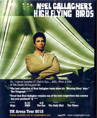
 Seeing as we are doing a song by Noel Gallagher, I felt that it was necessary to look at the magazine advert that has been created to advertise his new album. The advert again, has the main artist in the centre of the page looking straight at the camera. The identity of the person is easily made as at the top of the advert it says 'Noel Gallagher's High Flying Birds' in a font that I have seen him use across his platforms (see left). As well as this, there is quite a lot of text in the lower third of the advert. All of the text that has been included includes things such as 'No1 Album Including....' and also pull quotes from popular newspapers and magazines that have reviewed the magazine. These would be included to reinforce to the audience that what they are buying is actually of good quality. As well as the pull quotes, there are user ratings which also would influence someone buying this album or looking at it. The advert also contains a note to say how tickets are available for Noel's tour at different arena's across the country followed by a website to go on to purchase the,. The bottom right hand corner of the advert contains the logo of Noel's record label, Sour Mash, and his personal fan based website.
