Once we had all of the footage it was time to edit it. To edit the footage and compose a video, we had to use a programme called
Final Cut Express. This was a programme everyone in the group was unfamiliar with as we have never had to undertake a project like this before. I have however managed to have a play with it once before when I was on a work experience placement so the idea was familiar, but I was as unsure as everyone else as to how to produce a video. The following steps that I will write about is how we edited both the rough cut and final cut. The first thing to do in order to begin editing is to upload the footage on to the computer. In order to do this, we just had to load up the Final Cut programme and plug the camera in and upload it, not too difficult. Once the footage was on the computer it was time to look at the layout of Final Cut and begin to experiment with the different sections we were faced with.
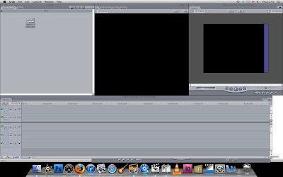 |
| Final Cut Home Screen |
Above is what we were faced with when Final Cut was loaded. As I have said, I have seen Final Cut been used before, both from my work experience and also from seeing previous years use it.
I understood that the bottom of the screen is the time line where you place the audio and visuals to the video. Other than this, I was not entirely sure of what else to do.
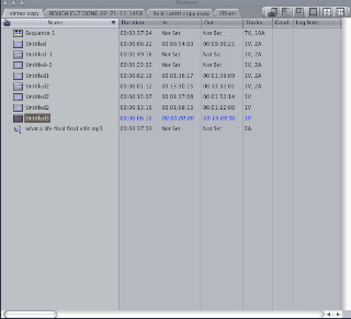 |
| 'Browser' - Where Our Footage Went To |
So, we uploaded the footage and noticed that it went to the top left hand corner of Final Cut in a screen called
'Browser'. As you can see on the right hand side, I have taken a screen grab of the section of Final Cut that contains all of the footage, audio and other pictures that we wanted to include. As we had a few different pieces of footage from different filming days, it was essential to rename everything so as we knew where to look when we wanted to take a bit of footage, so after it was uploaded and given the name 'untitled' I went through and re-named them to things that the rest of the group would know so as they could find footage if they were editing. The easiest thing to do was to add the audio in to the editing suite. To do this, we just had to open the file and drag it to the bottom of the time line. Below is what it looked like when the audio was dragged into place.
 |
| Audio Time Line |
The next thing to do was to get the story board and start trying to refer to that when editing. The story board showed that the first shot was a locational shot of a tunnel that we wanted our model to perform in. We also knew that we wanted this footage when we went up to London, as the whole idea of the video was a performance style. So, to start the video, I located the footage with the bits of the tunnel that we had filmed and the parts where we had Glenn in the tunnel performing and began to take it and add it to the time line. This was a fairly straight forward process to do.
 |
| Viewer |
 |
| Mark In/Out Arrows |
When we uploaded the footage and re-named it and then found the bit of filming we wanted to edit, it showed up in the middle box of the Final Cut screen. This is called the
'Viewer'. The chosen footage appears here. From speaking with our teacher, we knew that we had to do a process called 'mark in' and 'mark out' and then drag the footage to the time line. So, the 'viewer' showed the uploaded footage that was saved on to the computer and then we played it to locate the parts that we wanted. When we found the piece of footage that we wanted, me had to put a
'mark in' and then a
'mark out' when that section of footage had finished. From work experience I remember that you use the
'I' and
'O' keys on the key boards to do the marking -
'I' to mark in and 'O' to mark out. The mark in and out bar is seen above left with the blue arrows. Once the arrows are there with the footage that I want to be included in my edited piece, I had to simply drag the marked footage from the 'Viewer' box and place it on the time line.
 |
| Footage For Time Line |
On the left hand side is what the marked in and out footage looks like once you drag it down to the time line. It shows a small image of the start of the shot and the name of where the footage was taken from.
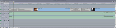 |
| Time Line With Visuals And Audio |
So, after taking a few different clips from the viewer and the different footage that we have filmed over the few days we went to London with Glenn, the time line started to look a lot like the one above. You can see how the
audio is at the bottom of the tracks
(in green) and the
visuals are in blue. As well as the blue you will notice that there are
grey boxes at the start and end of some of the marked in and out footage. These are
transitions that we added in, in order for the video to look authentic and not look like it has been thrown together with just quick cuts. The transitions that we added in to the footage included
'cross dissolves' and a variety of different
fades. Adding the different effects in to the footage was quite an easy process that is explained below.
 |
| Effects |
 |
| Transitions |
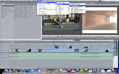
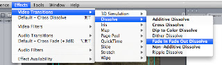
When we wanted to add an effect to a certain piece of footage, we had to select either the start or end of the footage (depending on where the effect is) add click
'Effects' at the top of the page on the Final Cut menu.
The screen grab on the top left hand side of the screen shows how I have selected a piece of footage (the first blue box on the top line) at the start of the clip. I have then clicked on 'Effects', 'Video Transitions', 'Dissolve' and 'Cross Dissolve'. This then adds in the appropriate transition depending on what is clicked and from here you can alter the length and duration of the effect. (the picture bottom left is a close up of the steps taken to add the dissolves).
 |
| Speed |
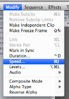
So, the transitions were easy to add into the footage and the video was coming together nicely. We did notice that some of the shots were too quick and would look better if they were slowed down to fully appreciate the shot and so as it went with the music a bit better. I wasn't sure how to edit the footage to slow it down so I looked at the top menu bar to see if there was anything there. There is a tab called
'Modify' so I assumed this may have something to do with it, and after clicking on it there is another link called
'Speed'. There were a few shots that needed to be
'under cranked' or slowed down and to do this I just clicked on the footage that needed to be under cranked and went to and 'modify''speed' and was faced with the screen on the right hand side.
 |
| Making Tracks Bigger |
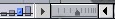
With the video coming together nicely, when I played it through I noticed that there were some black gaps in it that needed to be filled. From looking at the time line as it was, I could no identify where the gaps were, I needed to zoom in. I was unsure how to do this but notice another student in the class had managed to, so I asked how it was done. On the bottom left hand corner of the time line, there is a little scroll bar (the one above). By dragging the dark grey arrow between the two faced in arrows, you can alter the size of the time line to all squashed up and to being on one screen, to all spread out, showing the milliseconds of the video rather than seconds and minutes. After making the time line as spread out as possible and showing the milliseconds of the video, I could then scroll across and find where there were any gaps and properly join the footage together or add an appropriate transition depending on what was needed.
With the video now fully completed from start to finish there were a few things that I noticed when viewing the video all the way through. Firstly, the obvious thing was that in order for our video to follow the conventions of a contemporary music video out in the media today, we had to include a title for the song (as all music channels do when they introduce a song) and also a logo for a certain music channel. As well as this, I noticed that some of the shots were in wide screen and some were not. This proved a problem as some of the footage had black bars at the top and bottom (from the wide screen shot) and some did not. I could not remove the footage that had the black bars at all, so I tried to find a way of adding the bars to the rest of the footage.
 |
| MTV Rocks Logo |
 |
| Image + Wireframes |
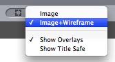
So the first thing I did was to sort out the title and logo for the video. This was a very straight forward process to do. As a group we decided that our video would probably most fit on the channel MTV Rocks (left) due to the genre of the music that we are using. Now that we had decided to focus the video around MTV Rocks, it was time to go and find the logo. I did a simple Google search to find the logo and noticed that some of the logos that came up had different coloured backgrounds or in fact, just a white background. A different coloured background would mean that the colour would appear on the video and look unprofessional, so it seemed that we needed the logo that had a transparent background. The best logo we could find with the transparent background was from Wikipedia. I clicked on the Wikipedia logo - found here -, saved it to the desk top, and then went back in to Final Cut. Once Final Cut was back on the screen, I just went to 'File', 'Open' and then opened the image that I had just saved. The image then opened up in the 'Browser' box, where all of the footage we have is located. From here all I had to do was drag the picture from the 'Browser' on to the time line to the start of the video. (Below shows how it looks on the time line) Once the logo was dragged on to the time line in the appropriate place, I had to reduce its size as it blew up the size of the video. In order to do this I had to 'key frame' the image. Key framing is something that is done in editing that can animate things. In order to reduce the size of the logo so that it just sits in the top left hand corner of the screen, I had to make sure key framing was turned on for that particular image. To do this, I had to click on the image and then on the top of the 'Canvas' box there is a box that I clicked and then selected 'Image+Wireframe'. Once this was selected, it was a case of reducing the size of the image and just dragging it to the area of the screen that I wanted it.
 |
| Time Line With Logo's And Locked Footage |
From the screen shot above, you will notice a few different things that should be explained. Firstly, there are 5 different layers of footage. Why? As well as this you may notice how there is grey hatching over the whole of the footage, again, why?
 |
| Locking Logo |
Firstly, the reason they grey hatching is there is because I have locked the layers. If you do not lock a certain line and you add some footage above it, then the footage that is added on top forces the footage that is below it to shift out of place thus making the whole of the video out of sync and ruined. So locking the layers just means that what you have edited stays in the place without moving ever unless it is unlocked. In order to lock the footage next to each line on the time line on the left hand side, there is a symbol of a padlock (right hand side image). All I had to do was click this and the line was locked. Locking also means you cannot edit anything in that selected line unless it is unlocked.
As said above, the other thing that I said above is that there are 5 different layers of footage and images. This is essential in editing. If it was all placed on one line then the above footage would be a straight clip with the screen showing only one visual at a time. With the over lays, the video can show a number of different images at the same time. So in this case, the above time line will show the video, with the logo, a green bar and text all at the same time without switching shots altogether. As well as this, over laying footage means you can have one big piece of footage playing, and change to other shots and then return back to the other piece of footage (the long bit playing) without having to go back and mark in and out and drag it back to the time line. We knew that we needed at the very least two layers, as one whole line is taken up by the MTV logo -it has to spread across the whole time line for it to appear in the whole video.
 |
| Green Title Bar |
After the MTV logo was added and positioned in the correct place on the screen, it was time to add the title bar and title of the song so as to introduce it. As a group we decided that the best colour for the title bar to be was green, so that it matched the colour of the logo and their website. In order to do this, I went on to the MTV Rocks website and took a screen grab of part of the green in a rectangular shape (the same size and shape roughly of the title bar itself). The screen grab of the green bar that I took is above. To then add this into the video, it was exactly the same process as adding the MTV logo - so save the screen grab, go to file, open, click the document, drag it to the time line on a separate layer, and then finally position it in the correct position. The final thing to do to the video was to add text that identifies the song and artist.
 |
| Effects - Text |
 |
| Writing Text |
This again was another simple process that was straight forward from just looking at the Final Cut programme. In the 'Browser' box, there is a tab called 'Effects'. I clicked on this which brought up a whole selection of effects. At the bottom of the list there was a selection called 'Video Generators'. In this folder there is a link called 'Text'. Once this is clicked on, another box opens up with different text effects, but because I just wanted a simple text addition, I clicked on 'Text' again. From here, in the 'Viewer' box, a box comes up where you can enter any text you wish, so I typed in 'What A Life - Noel Gallagher'. This then added the text so I had to drag this from the viewer ox down on to the time line, just above where I had placed the green bar. It was also important to start the text a little after the green bar starts. If you look at music videos, you will see that the title bar pops up first, and then the text shows. The FINAL thing to do with the video was just to add a transition to the bar and text. We did not just want the bar to pop up on the screen without warning and then just pop off again, so we thought it was appropriate from seeing other music videos to have it fade on to the screen, and fade off. To do this, I did exactly the same process as I did when adding fades and cross dissolves to other pieces of footage (explained above).
|
Time Line With Logo's And Locked Footage
This picture is above, however it is exactly what my time line looks like with the added green bar, text and appropriate fades. |
 After our research into magazine adverts for artists, we started to construct our own using Photoshop. The first thing we did was to look at all of the pictures that we took when we were up in London with Glenn to see what was the most appropriate to use as well as the best shot. Some of the pictures that we had would not have looked appropriate on a magazine cover as we felt that it did not relate to our video enough. In the end, we decided on one particular picture that we thought the audience would be able to say 'that is the advert to this particular song' (shown on the right hand side). The first thing to do once we had our picture, was to insert it in to Photoshop. The original picture lacks in brightness and contrast due to it being an overcast day when we took the picture, so the first bit of editing that we did to it was to change the contrast and brightness. The contrast was changed to +53 an the brightness to +7. From our research we noted that Noel Gallagher has an orange and green tint to all of his work (see below), so we decided to follow this convention and do exactly the same.


 Above is the title that we added to the magazine advert. Originally the title was just in white (left) and looked rather bland. As you can see from the picture, the top line of the title is in fact white, however we have added additional colours to the background of the text. The colours were easily added using different layers and by using the rectangle marquee tool (highlighted in the picture on the right) which was then placed behind the text. The colours that we used were exactly the same as the background to the image, so orange and turquoise.We also opted to use a font that Jay chose on the Internet called 'bitume'. With the title added in white, it did not look professional. It looked more like something that could have been made on Paint or Word, so, Jay changed the colour to the same turquoise as the colour of the box that was made behind the 'Noel Gallagher' part. We feel that the final title that was decided on works well with the colour schemes that we have used.

 The next thing that we added to the blog was to add pull quotes. The research showed that every single poster and advert has a quote from a popular magazine in order to further promote the band identity. Noel Gallagher's own poster that advertises his album is to the left hand side of the screen and you can see one of the pull quotes from that above. It reads.... "'Proof that Noel Gallagher remains one of the best songwriters this country has ever produced' Q ****". We decided to use this pull quote as it creates a more genuine feel to the poster that a leading music magazine such has Q has commented on the album. Another thing that we wanted to keep similar to Noel's original poster, was the type of fonts that he has used. We wanted to do this as people may relate a certain font to an artist as they use it across their different advertisement platforms. So, because of this, we searched on the Internet on a site called Da.Font.com and found one called Hobo Std. We chose this font as it is easy to read but has a certain style to it which is similar to Noel's advert.
 The picture on the right shows the magazine basically completed. As you can see, we have added a line about what the poster is actually advertising, so 'Number one album featuring AKA... What A Life...' is evidently advertising Noel Gallagher's latest album to be released. All of this was very simple to add on Photoshop. We simply used the text add tool and typed in what we wanted and changed the colours to suit the advert. We decided that the text that was to be added at the bottom of the advert was the ratings that other media companies have given to the album. We wanted to do this as we noted that this was a convention used n some magazine adverts by other artists. If the audience sees that a product has a high rating by a respectable company, e.g. The Daily Mail, then it must be good? As well as this, this is a convention that Noel Gallagher himself has adhered to. Because he has ratings on his magazine advert, we felt it was appropriate to add the same ratings to our design. We did this to make our advert as real as possible to further relate it to Noel Gallagher and his music. The four companies that we used were Mojo, The Sun, The Daily Mail and The Times. We felt that these companies are also good to include ratings from as they are large corporations in the media industry that reach a vast audience. The last piece of text that we added to the magazine was the parts at the bottom of the advert that read 'www.noelgallagher.com' and 'Sour Mash Records'. We added this for a bit of authenticity to the magazine. We noticed that with most adverts, they have a website for the artist that they are promoting. This is the website that Noel has used on his advert so we did the same. Sour Mash Records was added as this is the name of his record label which our audience may also be able to relate to.
  When we looked at the magazine we felt that it 'wasn't finished'. It looked too plain with a bit of colour and loads of text on the front, so we decided to add another rectangular box at the bottom of the page and reduce the opacity to see what it looked like. As you can see, the magazine advert looks a lot better with this addition. It breaks up the advert more and looks a lot more professional.

