
Showing posts with label Magazine Advert. Show all posts
Showing posts with label Magazine Advert. Show all posts
Tuesday, 20 March 2012
Sunday, 18 March 2012
Magazine Advert Ideas
Below. are the first two designs that we came up with when trying to create the magazine advert.
 |
| Initial Idea - No Link To Video, And Used Glenn's Actual Name |
Above was the first one that the group decided to create. We thought it was a fairly good picture and was straight to the point. Before we finished it off, we asked our teacher what she thought of the idea however it was quickly established that it was not good enough. The reasons it is not good enough are because:
- The picture has no resemblance to the music video as Glenn never wears this and the lighting never gets this dark,
- The neon effects on the text look childish and unprofessional
- The title of the song is there, however we have in fact used Glenn's actual name, when we should have put Noel Gallagher's name, who we are actually suppose to be promoting.
Because of this, we decided to scrap the idea and begin looking at other images that we had taken on the days of filming. The image below is of another idea that we had for the magazine advert. Before we could even finish it, we all agreed as a group that we did not like it. The colours were not right and did not look professional; the gradient was too light; the AKA.. What A Life did not look good slanted the way that it is; and there are too many fonts on the page.
 |
| An Idea For Magazine - Not Professional |
Thursday, 15 March 2012
Magazine Advert Research
Before we go and create our own magazine advert, we need to ensure we have done extensive research in to what we are getting ourselves in for. We need to look at conventions in to magazine adverts and see what we need to adhere to when creating our own. Below are a number of adverts that I have looked at to try and gain inspiration from to begin creating my own.


 Seeing as we are doing a song by Noel Gallagher, I felt that it was necessary to look at the magazine advert that has been created to advertise his new album. The advert again, has the main artist in the centre of the page looking straight at the camera. The identity of the person is easily made as at the top of the advert it says 'Noel Gallagher's High Flying Birds' in a font that I have seen him use across his platforms (see left). As well as this, there is quite a lot of text in the lower third of the advert. All of the text that has been included includes things such as 'No1 Album Including....' and also pull quotes from popular newspapers and magazines that have reviewed the magazine. These would be included to reinforce to the audience that what they are buying is actually of good quality. As well as the pull quotes, there are user ratings which also would influence someone buying this album or looking at it. The advert also contains a note to say how tickets are available for Noel's tour at different arena's across the country followed by a website to go on to purchase the,. The bottom right hand corner of the advert contains the logo of Noel's record label, Sour Mash, and his personal fan based website.

Above is a collection of the promotional material that was used to promote Adele's most recent album, '21' The top left image is the front cover of her album. As you can see, it is a close up shot of Adele herself, that has been desaturated. The artist is also looking away from the camera. The image is very similar to that of the magazine advert which is shown on the right hand side. Although the picture is not the same, there are similar aspects to it. The image is again, a close up of Adele looking away from the camera, and has also been desaturated however the pose is completely different to that of the album cover. In case the audience is not sure what the advert is trying to advertise, then the creators of the advert have inserted a thumbnail picture of Adele's album on the page with the words 'AVAILABLE EVERYWHERE NOW'. As well as this, there is a colour consistency across the two products with the desaturation and the white and green text which the audience would be able to identify further products to this artist and the album. There is also some small print at the bottom of the magazine advert with some legal disclaimers and company logos which appear to be a common convention with magazine adverts.
JLS:

As you can see from the advert, this is very simplistic, however gives across what is needed. The reason I have chosen this advert is because I am going to analyse their album for the digipak research. The advert is a plain black background with the band cropped in to the middle of the page. all are wearing similar clothing to each other and are expressionless. The band is further identifiable by the big bright coloured letters that read JLS. This further promotes the band to an audience and the colours make this more appealing to the eye and stand out more if seen at a distance. The fact that the bottom of the advert says 'In Stores 14th July' is enough to make an audience believe that their next album is going to be released on this date, and this is further reinforced as above this, it says 'JLS Beat Again' which would evidently be the name of the album.
Rihanna

Here is Rihanna's magazine advert promoting her latest album, Loud. The main image is of the artist pulling a certain pose. It appears that the image has been specifically taken for this advert as I cannot find the image any where else on the internet. You are instantly drawn to the advert due to Rihanna's bright red hair which has been used to maintain a brand identity with her digipak. The digipak can bee seen in the bottom right hand corner of the advert, and you can see it is an extreme close up of Rihanna's face, yet you can still see her bright red hair. The advert also has the artists name printed at the top in a faint text so as not to ruin the image that is the main feature of the page. The name of the album is also present on the advert, Loud, and this is needed to make the audience fully aware of what they are going to purchase. Again, just like the JLS advert, this is quite a simplistic advert, as the bottom is a simple message to say that the album is out now ready to purchase and that it 'INC. 'Love The Way You Lie' and 'Only Girl (In The World)''.
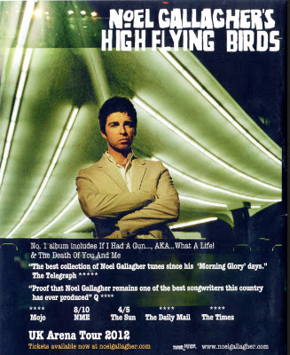
Noel Gallagher
 Seeing as we are doing a song by Noel Gallagher, I felt that it was necessary to look at the magazine advert that has been created to advertise his new album. The advert again, has the main artist in the centre of the page looking straight at the camera. The identity of the person is easily made as at the top of the advert it says 'Noel Gallagher's High Flying Birds' in a font that I have seen him use across his platforms (see left). As well as this, there is quite a lot of text in the lower third of the advert. All of the text that has been included includes things such as 'No1 Album Including....' and also pull quotes from popular newspapers and magazines that have reviewed the magazine. These would be included to reinforce to the audience that what they are buying is actually of good quality. As well as the pull quotes, there are user ratings which also would influence someone buying this album or looking at it. The advert also contains a note to say how tickets are available for Noel's tour at different arena's across the country followed by a website to go on to purchase the,. The bottom right hand corner of the advert contains the logo of Noel's record label, Sour Mash, and his personal fan based website.
Adele

Above is a collection of the promotional material that was used to promote Adele's most recent album, '21' The top left image is the front cover of her album. As you can see, it is a close up shot of Adele herself, that has been desaturated. The artist is also looking away from the camera. The image is very similar to that of the magazine advert which is shown on the right hand side. Although the picture is not the same, there are similar aspects to it. The image is again, a close up of Adele looking away from the camera, and has also been desaturated however the pose is completely different to that of the album cover. In case the audience is not sure what the advert is trying to advertise, then the creators of the advert have inserted a thumbnail picture of Adele's album on the page with the words 'AVAILABLE EVERYWHERE NOW'. As well as this, there is a colour consistency across the two products with the desaturation and the white and green text which the audience would be able to identify further products to this artist and the album. There is also some small print at the bottom of the magazine advert with some legal disclaimers and company logos which appear to be a common convention with magazine adverts.
Wednesday, 14 March 2012
Ancillary Tasks
So, back to the brief:
1. A promotion package for the release
of an album, to include a music promo video, together with two of the
following three options:
- a website homepage for the band;
- a cover for its release as part of the digipak (CD/DVD package);
- a magazine advertisement for the digipak (CD/DVD package).
Subscribe to:
Posts (Atom)